


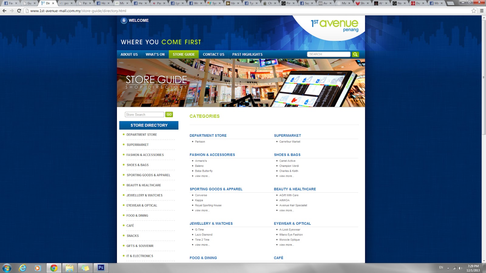


The overall color mode in this website is from the 1st Avenue logo, which consumes blue, green and white. The site map is placed on the bottom of every webpage. The wireframe is the same in every page. The navigations are simple and easy to understand.


The overall color used are green and white. The website gives a very fresh and active feeling. Every webpage has a different header. In some pages, the sub navigation is placed on the right side instead. The whole website is very consistent and looks nice. The sitemap can be easily located at the bottom of each page.


The overall feeling this website give is every clean and organized. The fonts used in sub navigation and some text is hard to read. Different webpage has different colored header. The way they show the happenings with a calender theme is nice and easily understand.


The overall website is simple and not very attractive at the main page. The navigations are almost the same as Gurney Plaza website. This website is clean and simple. I like the way the floor plan is showed.
