Local Agencies.
Design Agencies
Wednesday, October 10, 2012
Beautiful Web Designs #6
Tuesday, October 9, 2012


This website has a very beautiful background for it's content. The way the content is connected is very special. Even though the content is arranged out of the grid system, it actually gives an attractive feeling. The content is placed accordingly so it's easy to understand it.


This website promotes on its vector icons. Therefore the background features different varieties of icon to attract and let people get a basic information on the site. This website is very simple, it displays icons to attract customer and uses contrast color on the big button to show that the main thing they want is users to buy their icons.


I really like the navigation and the way this website changes it's content. There are different designs and typography treatment at every pages of the content. It is interesting. But somehow, certain page is too contrast for the comfort of the eye for me.

This website is still under construction, but the overall is very attractive. The main page shows the description of the Owner of the site. The way the words are played is very attractive and playful. I like the way the site looks like we're sitting on the elevator and going floor by floor to view his/her portfolio. I also find it interesting that with every different projects, the image on the top left changes too.
Beautiful Web Design #5
Tuesday, October 2, 2012


This website is really neat and nice. The contents are all aligned nicely. The space between contents are also very good. It does not make user feel complicated or crowded. The mouse over button effect can be improved to make it more interesting.


This website is mostly in grey scale. Once user mouse over to certain contents, the content will have color. This creates contrast between the content and the background.


The layout for this website is very simple but interesting in a way. The contents are placed really large. There is also a keyboard navigation which can be found when click on the small keyboard icon on the right. The content in the website is well aligned.


This website is like a blog diary. The header of the site is very interesting with cute and simple illustrations. The content is well aligned to avoid making the site look complicated.
Beautiful Web Analysis #4


This website is a nutrition website, the illustration of a person eating the burger really brings out the message. The grid used on this site is simple and nice. The fonts are all used in a large point size. It is interesting and easy to understand.


This is a site where they sell wedding dresses, headpieces..etc all laces. The main page really attracts people's attention with the photo of the model wearing their product. The whole website is very feminine and soft which suits the product - lace, really well.


This website helps people design their websites. All of the information on this site are mostly presented with infographic which is really interesting and eye catching. Everything is placed largely and does not look boring. The main banner really attracts user to understand what the site is about.
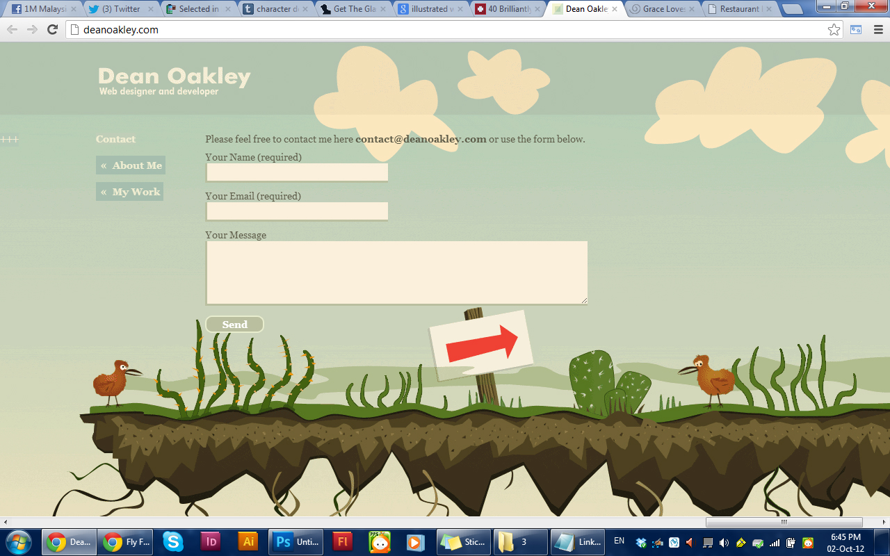
The beautiful illustration in this website is really eye catching and interesting. The way the illustrated tree becomes a line for alignment for the content is also interesting. The way the content is blended with the illustration is very nice.
Beautiful Web Analysis #3

This website have interesting illustrations below the informations. The scroll is also special compared to normal ones as this scrolls from left to right. The most eye catching thing in this site is the illustration.


This website uses a big illustration as the background to make it interesting instead of just one tone background. The Grid and alignment of the site is simple yet interesting. There is also a button "feeling lost?" to help users find whatever they want through categorizes and monthly archives.


This website focus on making children games. Therefore it uses really interesting and kid suitable illustrations. The way the information placed are nice and neat. The roll over effects on the buttons are also nice.


This is a travelling/flight site. The placement of the information are very good. The main thing which is the booking of flights is placed on the left, which is a hot spot when users enter the site. The navigation is also very user friendly. Infographic is used for easier understanding.
