This website is a nutrition website, the illustration of a person eating the burger really brings out the message. The grid used on this site is simple and nice. The fonts are all used in a large point size. It is interesting and easy to understand.
This is a site where they sell wedding dresses, headpieces..etc all laces. The main page really attracts people's attention with the photo of the model wearing their product. The whole website is very feminine and soft which suits the product - lace, really well.
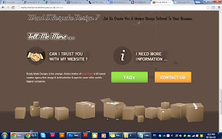
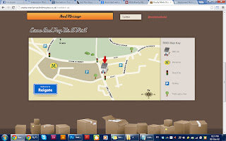
This website helps people design their websites. All of the information on this site are mostly presented with infographic which is really interesting and eye catching. Everything is placed largely and does not look boring. The main banner really attracts user to understand what the site is about.
The beautiful illustration in this website is really eye catching and interesting. The way the illustrated tree becomes a line for alignment for the content is also interesting. The way the content is blended with the illustration is very nice.


