
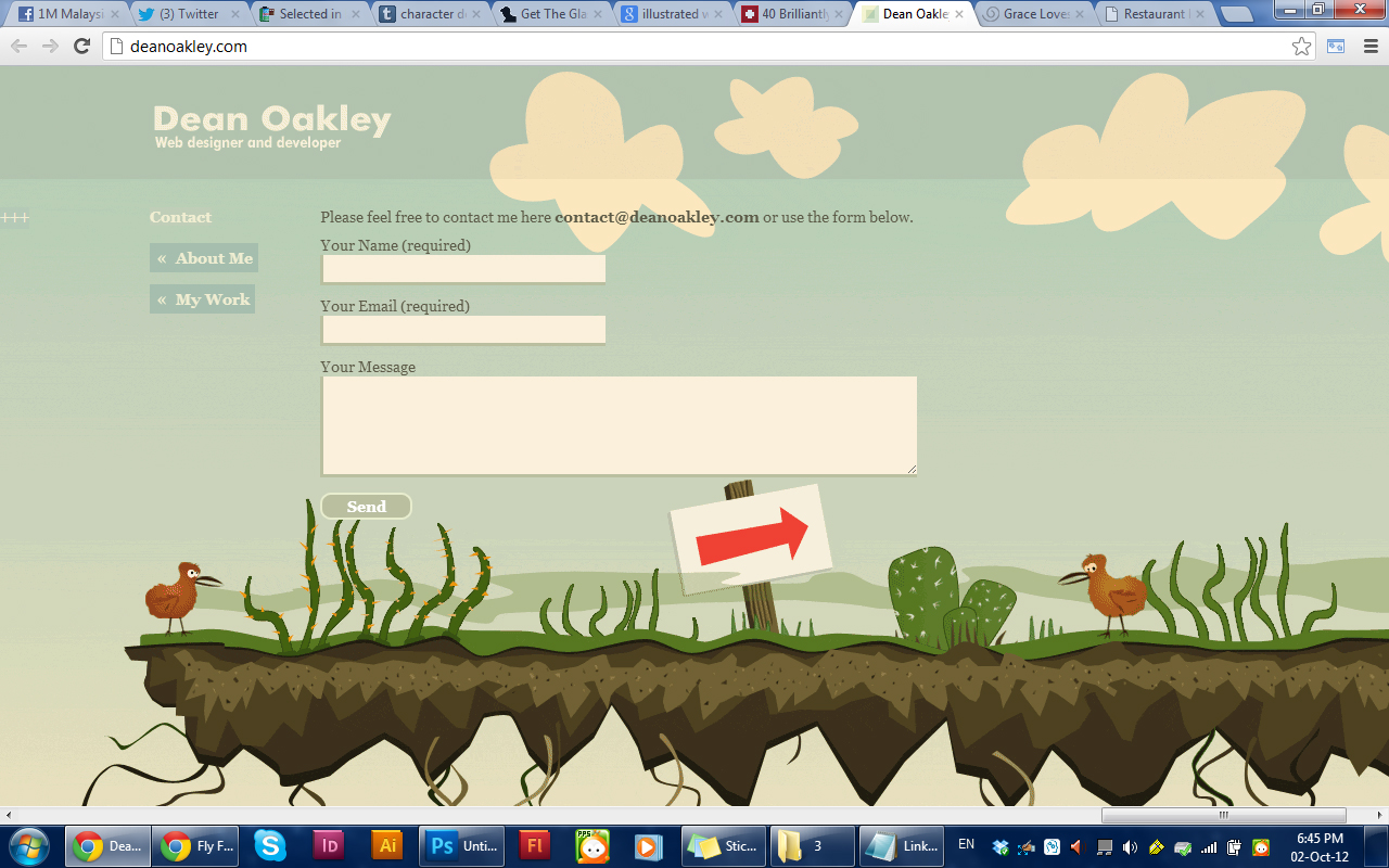
This website have interesting illustrations below the informations. The scroll is also special compared to normal ones as this scrolls from left to right. The most eye catching thing in this site is the illustration.


This website uses a big illustration as the background to make it interesting instead of just one tone background. The Grid and alignment of the site is simple yet interesting. There is also a button "feeling lost?" to help users find whatever they want through categorizes and monthly archives.


This website focus on making children games. Therefore it uses really interesting and kid suitable illustrations. The way the information placed are nice and neat. The roll over effects on the buttons are also nice.


This is a travelling/flight site. The placement of the information are very good. The main thing which is the booking of flights is placed on the left, which is a hot spot when users enter the site. The navigation is also very user friendly. Infographic is used for easier understanding.
