Billy's
- attractive header than moves according to mouse.
- navigation looks interesting.
- overall design is like vintage movie theater.
Timesquare HongKong
- The main page is special because it uses scenes of hong kong and the navigation is simple but looks profesional.
- But the scenes are pixelated and follows the browser size so it will be distorded if the browser is on portrait.
- The cube changing page is interesting.
- The navigations in subnavi are all movable according to mouse.
- Floor plans are interesting but the texts are far on the left side and a little small.
- The respond is a little slow.
Whampoaworld
- The navigation is attractive and unique.
- There is sound effects when rollover the navigations.
- The "more" is like floating and makes it attractive.
- Shop finder page is interesting. The floor plan is nice and the way it navigate is attractive.
iSquare
- The webpage is clean and only have a few colors.
- The way the pages change to another is interesting.
- The overall style is bold and clean.
- Content text are not too small.
This website shows a very elegant and girlish style with lots of lace design. The font sizes are big enough for people to read easily. The sub navigations are placed on the right side.
This website really attracts people's attention with the background music, it brings people into a happy mood. The overall color of the website is from its logo color with is gold. The mouse over effect on the navigations are really beautiful. The building map is different compared to other mall websites, and the pop up floor map is also nice.
The index page of this website shows a big banner about their shopping center. After entering the website, the wireframes are all the same each page. The sub navigations are placed on the left side. The overal feeling of this website is very sleek but gets boring after staying on the website for too long.
This website is more focused on families. The top navigation bar is always at the top no matter where you scroll which is really convenient. The mouse over effect of the navigation button is simple but it displays a photo related to the option, which is really nice and helps in understanding the content.
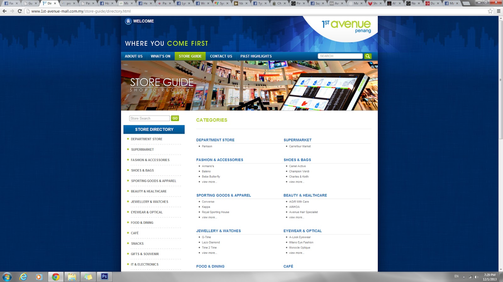
The overall color mode in this website is from the 1st Avenue logo, which consumes blue, green and white. The site map is placed on the bottom of every webpage. The wireframe is the same in every page. The navigations are simple and easy to understand.
The overall color used are green and white. The website gives a very fresh and active feeling. Every webpage has a different header. In some pages, the sub navigation is placed on the right side instead. The whole website is very consistent and looks nice. The sitemap can be easily located at the bottom of each page.
The overall feeling this website give is every clean and organized. The fonts used in sub navigation and some text is hard to read. Different webpage has different colored header. The way they show the happenings with a calender theme is nice and easily understand.
The overall website is simple and not very attractive at the main page. The navigations are almost the same as Gurney Plaza website. This website is clean and simple. I like the way the floor plan is showed.